

temizyurek

This monthly article series shows a dashboard with aggregate industry metrics in materials. It is also a review of sector ETFs like the Materials Select Sector SPDR ETF (XLB) and Invesco S&P 500® Equal Weight Materials ETF (NYSEARCA:RSPM), whose holdings are used to calculate these metrics.
Shortcut
The next two paragraphs in italic describe the dashboard methodology. They are necessary for new readers to understand the metrics. If you are used to this series or if you are short of time, you can skip them and go to the charts.
Base Metrics
I calculate the median value of five fundamental ratios for each industry: Earnings Yield (“EY”), Sales Yield (“SY”), Free Cash Flow Yield (“FY”), Return on Equity (“ROE”), Gross Margin (“GM”). The reference universe includes large companies in the U.S. stock market. The five base metrics are calculated on trailing 12 months. For all of them, higher is better. EY, SY and FY are medians of the inverse of Price/Earnings, Price/Sales and Price/Free Cash Flow. They are better for statistical studies than price-to-something ratios, which are unusable or non available when the “something” is close to zero or negative (for example, companies with negative earnings). I also look at two momentum metrics for each group: the median monthly return (RetM) and the median annual return (RetY).
I prefer medians to averages because a median splits a set in a good half and a bad half. A capital-weighted average is skewed by extreme values and the largest companies. My metrics are designed for stock-picking rather than index investing.
Value and Quality Scores
I calculate historical baselines for all metrics. They are noted respectively EYh, SYh, FYh, ROEh, GMh, and they are calculated as the averages on a look-back period of 11 years. For example, the value of EYh for packaging in the table below is the 11-year average of the median Earnings Yield in packaging companies.
The Value Score (“VS”) is defined as the average difference in % between the three valuation ratios ((EY, SY, FY)) and their baselines (EYh, SYh, FYh). In the same way, the Quality Score (“QS”) is the average difference between the two quality ratios ((ROE, GM)) and their baselines (ROEh, GMh).
The scores are in percentage points. VS may be interpreted as the percentage of undervaluation or overvaluation relative to the baseline (positive is good, negative is bad). This interpretation must be taken with caution: the baseline is an arbitrary reference, not a supposed fair value. The formula assumes that the three valuation metrics are of equal importance.
Current data
The next table shows the metrics and scores as of writing. Columns stand for all the data defined above.
VS
QS
EY
SY
FY
ROE
GM
EYH
Mr
FYh
ROEh
GMh
RetM
RetY
Chemicals
-9.76
-3.55
0.0289
0.4644
0.0194
16.75
42.00
0.0419
0.4475
0.0198
17.85
42.39
-7.10%
4.01%
Constr. Materials
17.48
32.97
0.0488
0.6918
0.0563
20.06
36.43
0.0412
0.7882
0.0385
13.80
30.22
-8.10%
16.22%
Packaging
-12.36
-2.16
0.0420
1.1149
0.0248
16.40
27.09
0.0490
1.0330
0.0358
18.57
25.23
-1.11%
10.64%
Mining/Metals
-3.87
-1.18
0.0389
0.9083
0.0302
7.93
24.14
0.0419
1.1505
0.0259
9.43
21.25
-12.17%
4.27%
Click to enlarge
Value and Quality chart
The next chart plots the Value and Quality Scores by industry (higher is better).
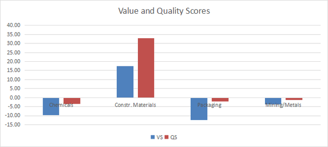
Value and quality in materials (Chart: author; data: Portfolio123)
Evolution since last month
The value score has greatly improved in construction materials.
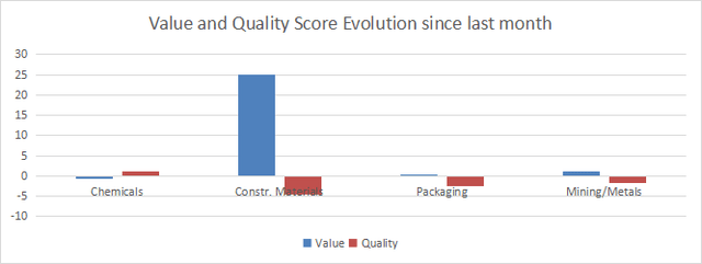
Score variations (Chart: author; data: Portfolio123)
Momentum
The next chart plots momentum data.
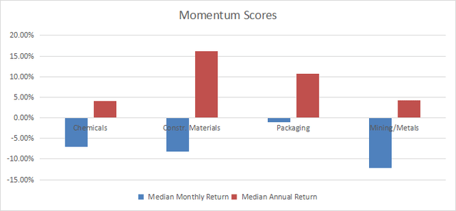
Momentum in Materials (Chart: author; data: Portfolio123)
Interpretation
Based on my latest S&P 500 dashboard, the basic materials sector as a whole is moderately overvalued relative to 11-year averages. However, the construction materials industry looks quite attractive regarding value and quality scores. Mining/metals is very close to its historical baseline in valuation and quality. Packaging and chemicals are slightly overvalued, by 10% to 12% based on the same metrics.
Fast facts on RSPM
Invesco S&P 500® Equal Weight Materials ETF has been tracking the S&P 500 Equal Weight Materials Index since 11/01/2006. It holds 29 stocks and has a total expense ratio of 0.40%, whereas the capital-weighted ETF XLB charges only 0.09%.
All constituents have the same weight after every rebalancing, but they may drift with price action. The next table lists the top 10 holdings, with an aggregate weight of 39.1%. These are the stocks with the highest price momentum since the last rebalancing. Risks related to individual companies are lower than in XLB. The top name, Linde PLC, represents 21.5% of asset value in the capital-weighted fund.
Ticker
Name
Weight%
EPS growth %TTM
P/E TTM
P/E fwd
Yield%
NOT
Newmont Corp.
4.33
-123.89
N/A
16.63
2.04
SHW
The Sherwin-Williams Co.
4.23
8.85
35.90
30.64
0.81
FMC
FMC Corp.
4.03
125.18
5.56
18.51
3.78
CF
CF Industries Holdings, Inc.
3.98
-53.52
14.34
14.11
2.48
AMCR
Amcor Plc
3.87
-31.46
23.67
15.23
4.69
PKG
Packaging Corporation of America
3.83
-15.79
24.40
21.84
2.57
MOS
The Mosaic Co.
3.73
-88.33
37.41
10.86
3.04
LYB
LyondellBasell Industries NV
3.72
10.47
13.54
12.11
5.57
LIN
Linde Plc
3.71
14.69
34.34
29.09
1.23
IFF
International Flavors & Fragrances, Inc.
3.68
-8.18
N/A
23.09
1.65
Click to enlarge
Ratios: Portfolio123.
RSPM is cheaper than XLB regarding the usual valuation ratios:
RSPM
XLB
Price / Earnings TTM
18.63
25.08
Price / Book
2.41
3.15
Price / Sales
1.72
2.37
Price / Cash Flow
11.74
14.45
Click to enlarge
Data: Fidelity.
The next table shows that RSPM has outperformed XLB since inception in total return and Sharpe ratio (risk-adjusted performance). The gap in annualized return is about 1.3%.
Total return
Annualized return
Max Drawdown
Sharpe ratio
Volatility
RSPM
382.29%
9.26%
-61.18%
0.46
21.92%
XLB
291.16%
7.98%
-59.83%
0.41
20.89%
Click to enlarge
Data calculated with Portfolio123.
Nonetheless, RSPM is slightly lagging over the last 12 months:
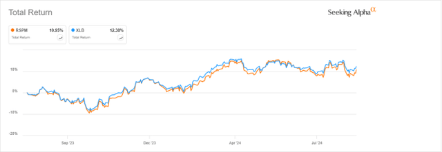
RSPM vs XLB, 12-month return (Seeking Alpha)
In summary, RSPM is a good fund for investors seeking exposure to basic materials without the concentration in the largest companies (especially Linde). Moreover, valuation and past performance are compelling. However, XLB is a better instrument for trading and tactical allocation strategies, thanks to much higher trading volumes.
Dashboard List
I use the first table to calculate value and quality scores. It may also be used in a stock-picking process to check how companies stand among their peers. For example, the EY column tells us that a chemical company with an Earnings Yield above 0.0289 (or price/earnings below 34.60) is in the better half of the industry regarding this metric. A Dashboard List is sent every month to Quantitative Risk & Value subscribers, with the most profitable companies standing in the better half among their peers regarding the three valuation metrics. The stocks below are part of the list sent to subscribers a few weeks ago.
CE
Celanese Corp.
BLDR
Builders FirstSource, Inc.
LIME
Apogee Enterprises, Inc.
GFF
Griffon Corp.
OC
Owens Corning
Click to enlarge
It is a rotational model with a statistical bias toward excess returns on the long-term, not the result of an analysis of each stock.
Editor’s Note: This article discusses one or more securities that do not trade on a major U.S. exchange. Please be aware of the risks associated with these stocks.


GIPHY App Key not set. Please check settings